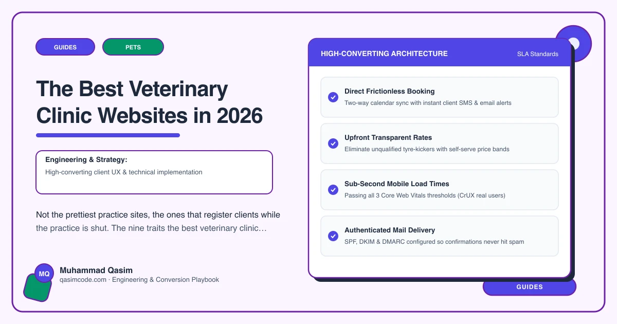
Best means registered, not prettiest
Veterinary websites tend to compete on soft photography of puppies. Judged instead on new registrations, filled diaries and calls that reception did not have to take, the good ones share nine traits.
All nine answer the four questions an owner is holding when they land: what does a consult cost, can I register and book without ringing, are these people any good, and what happens if something goes wrong at midnight.
1. Registration and booking as one flow
The best practice sites do not separate the two. A new owner picks an appointment type, gives their details and their pet's details, agrees to the practice terms, and arrives already on the system. Vetstoria, ezyVet, Provet Cloud and Covetrus each offer a route to this, with the detail depending on your setup.
The test is what reception does when that client walks in. If the answer involves a clipboard, the site is not finished.
2. Real-time availability, not a request form
A form that gets answered tomorrow loses the owner tonight. Availability read from the practice diary, bookable at any hour, with the slot length set by the appointment type rather than by hope.
3. Consultation fees and health plans stated
The best sites publish the consult fee and set out plan tiers with what each one includes: vaccinations, parasite treatment, health checks, and how the monthly payment works. Owners want that before they register, and stating it plainly removes most fee disputes at the desk before they can happen.
4. An emergency route on every page
Tap-to-call in the header, opening hours visible, and one plain sentence saying whether you provide out of hours cover yourself or who does it for you. Any owner guidance on the page should be written or approved by your own vets and should always lead back to calling someone, never stand in for examining the animal.
This is the trait most practice sites do worst and the one owners remember most vividly.
5. A page per service, not a list
Vaccinations, neutering, dental, surgery, and whatever else you actually do. Each page explains what the procedure involves, what happens on the day, what it costs or what determines the cost, and books the right appointment type directly. That is also how a practice gets found for the searches that precede a registration.
6. The team shown properly, with registration
Names, faces, what each vet and nurse is interested in, and their professional registration details. Most regimes expect registration to be evident, and beyond compliance it is the most persuasive content on a practice site. Owners choose people, not logos.
7. Real photography of the actual practice
The consult rooms, the prep area, the kennels, the waiting room, reception. Not stock. A new owner is trying to picture handing over a cat, and a photo of your own room does that work. Get consent from owners for any animal in shot.
8. Reviews where the decisions happen
Google reviews pulled in near the booking buttons, not on a testimonials page nobody visits. A practice with two hundred reviews and no way to see them from the booking page is wasting its best asset.
9. Fast, structured and yours
Under two seconds on mobile data. Structured data so opening hours and location appear correctly in search. Tracking on booking clicks, call taps and registration completions, so you can see which pages fill the diary. Domain and hosting in the practice name.
What separates the top ones from the rest
The very best practice sites we see are not the most designed. They are the ones where somebody has clearly sat with the receptionist for an hour and listed the calls she takes: what does a consult cost, do you take new clients, my cat needs a booster, are you open Sunday, my dog has eaten something.
Then they built a page or a button for each of those, in the order of frequency. That is the whole method, and it beats any amount of styling.
What to check on your own site tonight
Load it on your phone on mobile data. Time how long it takes to find the consultation fee, how many taps to a booking with the right appointment type, and whether the emergency arrangement is visible from whatever page you happen to land on. Then do the same on the two practices nearest you.
The gap you find is the brief.
A note on wording
Veterinary advertising is regulated, and what a practice may claim differs by country. The RCVS Code in the UK, and state veterinary boards with AVMA guidance in the US, are the places to start. Describe what you do, avoid superlatives and guaranteed outcomes, and treat this as orientation rather than legal advice, with your own adviser confirming anything you are unsure of.
Where this sits
All nine traits are standard in a veterinary practice website we build, and the same standard runs through the other pet business websites we make. What each package covers is on pricing. Pretty is easy. A site that registers a client at eleven at night, with the pet's details attached, is the one worth having.