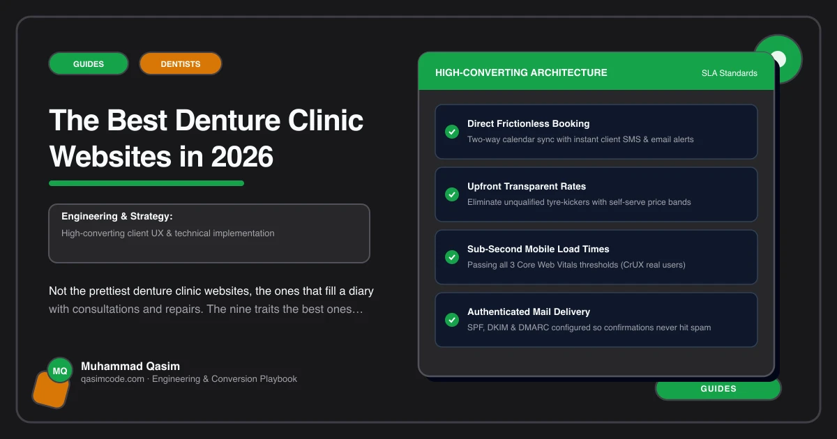
Best means booked
Denture clinic websites are usually judged on how modern they look. Judged instead on consultations booked and repairs caught, the good ones share nine traits. All nine serve the two people who arrive on the page: a patient who is often over sixty, often embarrassed, and worried about the cost, and the son or daughter helping them look.
1. Readable at the text size the patient actually uses
Generous base type set in relative units, high contrast, wide line spacing, short lines, big tap targets, and a layout that still works when the system text size is turned up. No copy inside images. This is the trait most sites in this field fail, and it is the one that decides whether the patient can use the site alone.
2. From-prices per denture type
Full, partial and implant-retained each with a from-price, what is included, how many visits, and any finance. One honest sentence about what changes the figure after a consultation. Cost is why people postpone, so the number is what turns a browse into a booking.
3. A repair page that ranks and answers
Its own page, not a bullet. Fee stated, turnaround stated, what to bring, whether you can do it while they wait, and how to be seen today. Repairs are urgent, searched for by name, and they bring people who later need a new set.
4. Booking and phone number, equal weight
A Book button in the header that opens the right appointment type in the practice system, with a tappable phone number the same size beside it. The daughter books, the patient rings, and neither is pushed into the other's route.
5. Qualifications explained in plain words
What your registration is, what it allows you to do, whether a patient can come to you directly and when a dentist needs to be involved. Written for someone who has never heard the term before. The best sites treat this as a patient page rather than a compliance footnote, while still meeting whatever their regulator requires.
6. The clinic and the people shown as they are
Photographs of your surgery, the chair, the laboratory bench, and the person who will do the fitting. Not stock. A patient who is embarrassed about their mouth is deciding whether these people will be kind, and faces answer that better than adjectives.
7. A page per denture type
Full dentures, partial dentures, implant-retained, relines, repairs, and home visits if you do them. Each with what it involves, how many appointments, its price line, and its own booking button. These are the pages that catch the searches people actually type.
8. What happens at each visit, in order
The consultation, the impressions, the try-in, the fitting, the reviews. How long each takes and how far apart they fall. Factual and calm, describing your process rather than promising outcomes. The uncertainty is what keeps people from booking, and a sequence removes it.
9. Fast, and measured
Under two seconds on a phone on mobile data. Booking clicks, call taps and enquiries recorded by page, so you can say whether the repair page or the fees page filled the diary last month.
What the best ones do not share
- A look. Warm and traditional, clean and clinical, and plain and local all work.
- A platform. Dentally, Software of Excellence, Cliniko, Jane and simple schedulers all appear.
- A big budget. Most are mid four figures.
- Many pages. Nine or ten well-made pages beat thirty.
Test your own, on your phone
On mobile data, in a private window, with your system text size turned up to a large setting:
- Can you read the home page without pinching, and does the navigation still work?
- Find the price of a full set. Under thirty seconds?
- Find how to get a broken denture seen today.
- Tap Book without scrolling. Is the right appointment type pre-selected?
- Find the phone number without scrolling, and tap it.
- Find out whether a patient can come to you directly.
- Find a photograph of your actual surgery and of the person who does the fitting.
- Search your main service plus your town. Are you on page one?
- Ask reception how many bookings came from the site last month, by page.
Seven or eight passes puts you ahead of nearly every denture clinic site in your area. Most pass two or three, and almost all fail the first one.
Where this sits
Those nine traits are the specification we build a denture clinic website to, and the list we run an existing site against before recommending anything. The same thinking shapes the wider dental practice websites we make, and the packages that include it are on pricing. The good looks are welcome. They go on top of a page the patient can actually read.