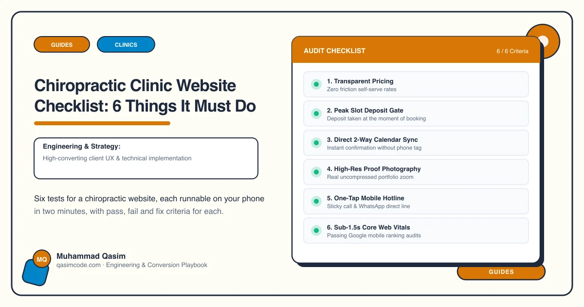
Six tests, ten minutes
A chiropractic website has two jobs at once: reassure a nervous first-time patient, and stay inside what your regulator lets you claim. Most fail one or the other. Run these on a phone.
1. Book a first visit online, at the right length
The test: book a new-patient appointment.
Pass: a longer first slot, an intake form sent in advance, and a reminder — all from your clinic software.
Fail: an enquiry form, or a booking that gives a new patient a fifteen-minute follow-up slot.
The fix: Jane, Cliniko, ChiroTouch, Zanda, Power Diary and Nookal all support separate appointment types. Getting the first-visit length right is the difference between a calm consultation and a rushed one.
2. Explain the first visit in plain words
The test: as someone who has never been adjusted, find out what will happen to you.
Pass: a first-visit page covering the consultation, the examination, the adjustment, what it feels like, and how long it takes.
Fail: nothing, or a page of technique names. Fear of the adjustment is the single biggest reason a first appointment does not get booked.
The fix: write it as short paragraphs in the patient's language, mention the noise, and link it from beside the booking button.
3. Publish care plans without sounding like a sales pitch
The test: find what a course of treatment costs.
Pass: typical courses with review points, per-visit and package prices, editable by you.
Fail: either no prices, or a plan presented as a commitment before anyone has been examined.
The fix: state the per-visit fee first and the packages second, with the review point named. Patients suspect chiropractic of selling long plans; pricing openly and reviewing at a stated point defuses it.
4. Stay inside the advertising rules
The test: read your own condition pages as if you were a regulator.
Pass: back pain, neck pain, headaches and sciatica pages written to what your regulator permits, with registration numbers stated.
Fail: claims about conditions outside the musculoskeletal scope your regulator allows. This is the most heavily policed area in the trade and complaints usually come from competitors.
The fix: write to the evidence and to your regulator's wording. A page that is careful still ranks — and a page that is not can be reported.
5. Show who is registered, and for what
The test: find each practitioner's registration number.
Pass: a profile per practitioner with qualifications, registration number and what they focus on.
Fail: first names and a group photo. Patients do check registers, and the ones who check are the ones who commit to a course.
The fix: a page each, registration stated, with a booking button for that person.
6. Load in under two seconds, and list your insurers
The test: on mobile data, count until the booking button is usable. Then look for insurers.
Pass: under two seconds, with the insurers you work with and how claims run stated on the fees page.
Fail: a slider, a chat bubble, and no mention of insurance.
The fix: one compressed image, chat off, booking deferred. Then name the insurers — for a patient with cover, that single list decides where they go.
Scoring
Six passes and the site is working. Four or five, fix in order. Three or fewer and the two to start with are the first-visit page and the care-plan prices — they answer the fear and the suspicion, in that order.
Where this sits
Our chiropractic websites are built to pass all six at a fixed price. The wider clinic version is on the clinics page. What you may claim differs sharply by country and regulator, which the country pages cover.