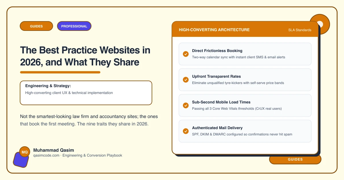
Best means the meeting got booked
Professional services websites are easy to make handsome. Serif type, a skyline, a photograph of a handshake, and the words "trusted advisers since 1987". None of that helps the person sitting at a kitchen table at nine in the evening trying to work out whether they need a solicitor and what it will cost.
The practice sites that work, measured by first meetings booked from the site rather than from referral, share nine traits. They answer three questions: do you do my exact thing, what will it cost, and can I trust you with it.
1. A page per service, in the client's words
Not one Services page with a bulleted list. A page for probate, a page for commercial leases, a page for limited company accounts, a page for remortgaging, a page for certified translation. Each titled the way a client would ask, each able to rank on its own, each carrying a booking button. This is the trait that separates the top few percent from everyone else.
2. Money addressed on the page
Fixed fees where the work is defined. Hourly ranges by seniority. Monthly packages by business type for accountants. A fee per document type for notaries. Where a price genuinely cannot be given, a plain paragraph on how you quote and what moves the number. Silence about fees is the most expensive design decision a practice makes.
3. The first meeting is bookable, with intake
A Book button in the header and on every service page, opening Calendly, Acuity, Microsoft Bookings or a practice tool with the right meeting type pre-selected, and three to six intake questions so the meeting starts with facts. The phone number sits beside it, not behind it.
4. Regulatory information that is current and easy to find
Registration numbers, authorisation status, professional body membership, complaints and redress routes, placed where your regulator expects and stored as editable records so they can be corrected in minutes. On the best sites this reads as confidence rather than small print.
5. Real people with real credentials
A profile per fee earner: photograph, qualifications, professional body, specialisms, a sentence in their own voice, and a booking button that books them. Clients hire a person, and the profile is where the decision is made.
6. What happens next, written down
A process page for the common matters: the stages, roughly how long each takes, what the client has to provide and when. Architects do this by RIBA-style stage; law firms by matter; mortgage brokers from decision in principle to completion. It removes the fear that stops people enquiring.
7. Under two seconds on a phone
Compressed images, no slider, no autoplaying video, a booking embed that reserves its space so the page does not jump, and hosting that is not the cheapest available. Most clients read about your service on a phone, at night, on patchy signal.
8. The practical layer
Client portal links where you use one. A secure upload where documents are involved, as translators and tax preparers need. A deadlines calendar. An insights section that answers real client questions rather than reposting industry news. Reviews where your regulator permits them, and only where it does.
9. Measured
Booking taps, completed bookings, form submissions and call taps, recorded by page. The partners know which service page produced meetings last month. That is how the site improves instead of ageing.
What they do not share
- A look. Traditional and reassuring; modern and spare; warm and personal. All work.
- A booking tool. Calendly, Acuity, Microsoft Bookings, Clio Grow, Karbon and Intelliflo all appear.
- A large budget. Most are mid four figures.
- Many pages. A sole practitioner does it in nine: home, services, fees, team, book, portal, regulatory information, insights, contact.
Check yours
On your own phone, private window, mobile data:
- Search the exact phrase a client would type for your most profitable service. Does one of your pages answer it?
- Find a fee, or an explanation of how you quote, in thirty seconds.
- Tap Book without scrolling. Does a diary open, or a form?
- Find your registration details, and check they are still correct.
- Find the person who would handle the matter, and book them.
- Find what happens after the first meeting.
- Count the load time.
- Ask whoever handles enquiries how many meetings the site booked last month.
Seven passes is a very good practice site. Most pass two or three.
Where this sits
These nine traits are the specification for every professional services website we build and the checklist a diagnosis runs an existing site against. Anything about regulatory placement here is orientation rather than advice; your own body's rules and your compliance lead decide the detail. The design sits on top of a structure that has already answered the client's three questions.