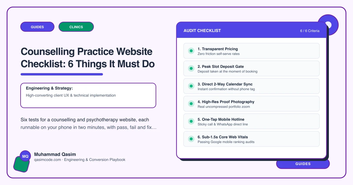
Six tests, ten minutes
A counselling website is read by someone who is not sure they want to make contact at all. Every extra field, every stock photograph of a sunrise, is a reason to close the tab. Run these on a phone.
1. Feel like a person, not a practice
The test: open the home page as someone anxious about ringing a stranger.
Pass: a real photograph of you, a plain description of who you help and how you work, and one clear next step.
Fail: stock imagery, a mission statement, and three competing calls to action.
The fix: one real photo and two honest paragraphs. This is the only trade where warmth outperforms polish, and it is the cheapest thing on this list to get right.
2. Offer both an enquiry and a booking
The test: try to make contact two different ways.
Pass: a confidential enquiry form for people not ready to commit, and online booking for people who are.
Fail: only a booking calendar, which many clients will not use for a first contact, or only a form, which loses the ones who are ready.
The fix: both, side by side. Jane, Cliniko, Zanda, SimplePractice, Power Diary and WriteUpp all handle the booking side; the enquiry form should ask for as little as possible.
3. State fees and the cancellation policy up front
The test: find the price of a session and what happens if someone cancels.
Pass: session length, price, cancellation terms, and whether you work online or in person — all stated before contact.
Fail: "fees discussed at initial consultation". Asking someone to disclose a personal difficulty before they know the price is a barrier, not a conversation.
The fix: publish the numbers. Include any concessionary rate you offer, with how to ask for it.
4. Have a page for each thing you work with
The test: search "anxiety counselling" plus your town, then "grief counselling" plus your town.
Pass: a page per area of work — anxiety, grief, relationships, trauma — written in the client's words, each with a next step.
Fail: one list of twenty presenting issues with no pages behind it.
The fix: write the four you see most. People search for what they are feeling, not for "counselling", and a page per area is a page per search.
5. Do privacy properly
The test: read your own privacy policy and count the fields on your enquiry form.
Pass: minimal forms, the correct data agreements for your country, and an honest privacy policy that says where enquiries go and who reads them.
Fail: a fifteen-field form, or a generic policy that names a plugin vendor. This is health data about a person who has not yet become a client.
The fix: cut the form to name, contact and a short message. Say plainly who sees it. Nothing raises enquiry rates in this trade like a form that asks for less.
6. Show registration, and load in under two seconds
The test: find your professional body membership. Then, on mobile data, count until the enquiry form is usable.
Pass: membership and registration where a client can check it, and the page usable in under two seconds.
Fail: an acronym in the footer, and a page with a slider and a chat bubble.
The fix: state the body, the registration and the level, and link the register. Then strip the page back — one compressed image, no slider, chat off.
Scoring
Six passes and the site is doing its job. Four or five, fix in order. Three or fewer and start with the fees and the form: publishing the price and asking for less are the two changes that most reliably turn readers into enquiries.
Where this sits
Our counselling practice websites are built to pass all six at a fixed price. The wider clinic version is on the clinics page. Data protection and title rules differ by country, which the country pages cover.