The searcher does not know what osteopathy is
Osteopathy has a marketing problem its neighbours do not: a large share of the people who would benefit cannot distinguish it from physiotherapy or chiropractic, and pick whichever site explains itself. Usually not yours.
Cause 1: nothing explains what you actually do
The symptom: a page about the philosophy of osteopathic medicine, and nothing that compares it to the alternatives the reader is also considering.
The change: a plain what-we-do page that compares osteopathy honestly with physiotherapy and chiropractic — where they overlap, where they differ, and when each is the better choice. Being honest about the overlap converts the uncertain searcher better than claiming superiority, and it ranks for comparison searches your competitors avoid.
Cause 2: first-visit anxiety is unanswered
What to wear, what the examination involves, whether treatment hurts, how long it takes.
The change: answer all four on one page, before they arrive. Undressing for an examination is the unspoken worry and almost no osteopathy site addresses it.
Cause 3: registration is buried or missing
Regulators expect registration numbers to be displayed, and patients increasingly look for them.
The change: registration number on every practitioner profile and in the footer. It satisfies both audiences at once.
Cause 4: booking is an enquiry form
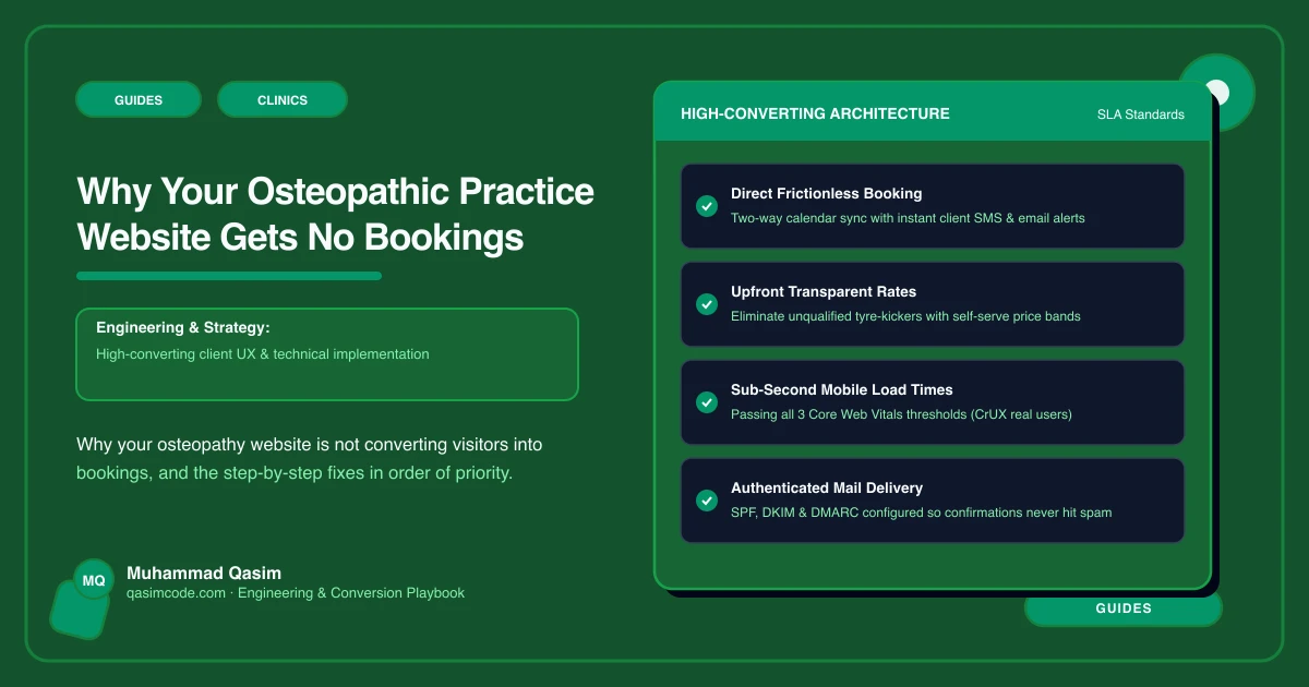
The change: live availability from Cliniko, Jane, Zanda, Power Diary or TM3, with a longer new-patient appointment type and intake forms sent in advance.
Cause 5: no page for the problem the patient has
Back pain, neck pain, sports injury, pregnancy-related pain. Patients search the problem.
The change: a page each, written within your regulator's advertising rules, each with a booking button.
Cause 6: fees are incomplete
The change: initial and follow-up fees, and any package rates. A patient planning a course needs the follow-up figure more than the first one.
Cause 7: the site is slow where the address gets checked
Patients look you up from a car outside, on one bar of signal, having already decided to come.
The change: one compressed image, no slider, chat off, and the booking script loaded only when the button is tapped. Under two seconds on mobile data. A page that is still loading is a patient who drives to the practice with parking they already know.
Fix them in this order
The what-we-do comparison page first — it is the differentiator no competitor is willing to write. First-visit page second. Booking third. Then registration, condition pages and fees.
Where this sits
Our osteopathic practice websites ship with a comparison page, a first-visit page and live booking, at a fixed price. The audit version is the osteopathy checklist. The wider clinic view is on the clinics page.