The visitor is deciding whether to tell a stranger something difficult
A counselling website is read by someone who has not yet decided to make contact at all. Every additional form field, every stock photograph of a sunrise, is a reason to close the tab. The causes below are ordered by how many enquiries they cost.
Cause 1: there is only one way to make contact
Some clients will book a slot. Many will not book anything until they have sent a message and had a reply. Offering only one route loses whichever group you did not build for.
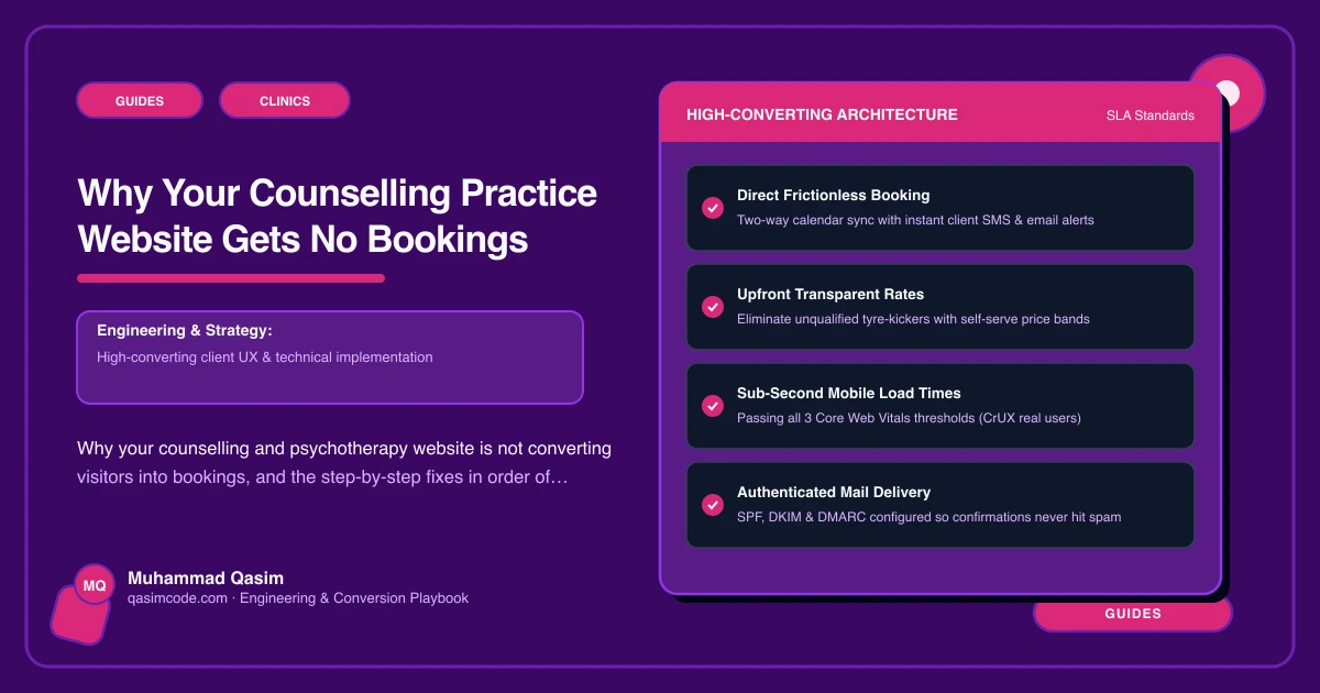
The change: a confidential enquiry form and online booking, side by side, with equal weight. Jane, Cliniko, Zanda, SimplePractice, Power Diary and WriteUpp all handle the booking side.
Cause 2: fees are hidden behind "contact me"
Asking someone to disclose a personal difficulty before they know the price is a barrier dressed as a conversation.
The change: session length, price, cancellation terms, and whether you work online or in person — stated plainly. Include any concessionary rate and how to ask for it. Clients who cannot afford it stop occupying your time, and the rest make contact already comfortable.
Cause 3: the form asks for far too much
The symptom: fifteen fields, including date of birth and a drop-down of presenting issues, before any human contact.
The change: name, contact, short message. Nothing raises enquiry rates in this field like asking for less. You can gather the rest once a relationship exists.
Cause 4: privacy is promised but not built
This is health data about someone who is not yet a client, sitting in whatever your form plugin uses.
The change: run forms and booking through tools with the correct data agreements for your country, store nothing on the site itself, and write a privacy policy that says exactly where enquiries go and who reads them. Then say so beside the form — it is reassurance, not legal boilerplate.
Cause 5: no page for what the client is feeling
Nobody searches "counselling". They search "anxiety counselling", "counselling after a bereavement", "relationship counselling".
The change: a page per area of work, written in the client's words, each with a next step. A page per area is a page per search.
Cause 6: the site does not sound like a person
The change: one real photograph of you and two honest paragraphs on who you help and how you work. This is the one trade where warmth outperforms polish, and it is the cheapest item here.
Fix them in this order
Fees and the shortened form first — together they lift enquiries fastest. Both contact routes second. Privacy third, because it is a real obligation as well as a conversion factor. Then the area pages, then the tone of the first screen.
Where this sits
Our counselling practice websites ship with both contact routes, minimal forms and correct data handling, at a fixed price. The audit version is the counselling checklist. The wider clinic view is on the clinics page.